“ Colour is an art form that needs practice. The eye has to train itself, has to learn to read the nuances that make up colour. It’s also a question of freedom, of submitting to nature, in order to let inspiration guide us.”
The artistic director of Ressource, Annabelle Vermont, speaks to us with enthusiasm and passion about her job as an expert in the field of colour, and shares the secrets of the range of colours she has created in collaboration with Revol.
Who is Ressource?
We are an independent family company rooted in skills we’ve been developing for four generations. It all began in 1946, in the ochre quarries of Roussillon, before evolving towards paint and, more recently, wallpaper. My cousin Pauline is head of the firm, and several members of the family are involved in this adventure, each of us contributing our own skills.
Above all, our palette of more than 1,000 colours, our great variety and our huge choice of decor for the public, architects, interior designers and artisans. It’s also our creative outlook. We bring out new collections each year with designers, architects, stylists, artists and colour historians, as well as colours created in-house.
The quality of our products and our large range of technical and decorative solutions are among our strengths, as are finishes adapted to all uses – long-lasting, resistant, high-quality paints. There’s also our range of special-effect paints, especially chalk-based paints with unparalleled eco-friendliness.
And finally there’s our green ethos and the fact that we only produce paint on demand in order to have minimal stock, of both paint and wallpaper. We are one of the last independent French manufacturers. Our factory and our workshops have always been based near Avignon.
How does one become artistic director of Ressource?
I arrived at Ressource a little more than five years ago to set up the wallpaper printing workshop – a project my family had had its heart set on for a long time. I’m passionate about pattern, so I designed the first collection of wallpaper and founded our production process. I became artistic director to bring fresh creative energy and start new projects, while maintaining our image and our DNA. So I’m going to work with the marketing team in developing new paint and wallpaper collections. For certain projects I’m going to create colours or patterns; with others, I’m going to manage partnerships with artists we’ve invited to collaborate with us.
Where does your passion for colour come from?
There has always been colour in my life. It was there naturally from childhood on, because of the family firm. My mother, my grandmother, artists and painters have sensitised me to art, materials, beauty. My mother and my aunt also worked for Ressource as colourists; I saw colour charts, projects that awakened my sensitivity and my tastes. Colour is an art form that needs practice. The eye has to train itself, has to learn to read the nuances that make up colour. It’s also a question of freedom, of submitting to nature, in order to let inspiration guide us.
How does one become an expert in colour?
With time, study and through projects and experimentation. Having fun reproducing colours is a lovely way of learning how they are made up. And Ressource’s expertise in every step from conception to production endows one with great skills. Ressource is very strong in both innovation and research. We have our own lab for developing new colours. It’s also about meeting the right people, sharing information and inspiration with other creatives, exploring other universes that can enrich our vision.
Talk us through your research into colour on a daily level
My work is very varied and embraces different things every day. I plan days or half days focused exclusively on creating colours. That requires total concentration on this one task. I need calm and solitude to follow my instinct, my creativity. I mix colours myself from acrylics in primary colours and a few complementary hues to add richness and harmonious possibilities: with cobalt blue, natural sienna, Prussian blue, natural shadow…
Either I let myself be guided by my blends by adding small hints of colour, or I have a precise idea of the colour I want to obtain and work towards getting as close as possible to it. The next step is to come back and look at the colours with a well-rested mind. I choose between the various options by placing the colour on a neutral wall then looking at it in comparison with the other colours to see what sets it apart, what characterises it.
You’ve wanted for several years to use your expertise in colour with other brands. What motivated your collaboration with Revol?
My family and I like to be involved in everything and experience different words. The possibilities of colour are so infinite that creativity is limitless, applicable to many different spheres: architecture, fashion, objects… In interior design, it’s also the art of association, composition, ranges. And we adore seeing colours come to life in decor, on objects, because it makes our work concrete. Surprise and satisfaction with the result are what drive us.
Working with Revol seemed an obvious step to us because we have common values dear to both of us and that form part of our history. We are both French family-run firms going back several generations, based in the South of France. The EPV (Entreprise du Patrimoine Vivant) heritage label that we’ve both been awarded bears witness to this.
We also found in Revol another passionate team proud of its artisan production. This joint project is a chance for Ressource to put our skills as colourists in the service of another interiors brand that contributes to the art de vivre we love so much.
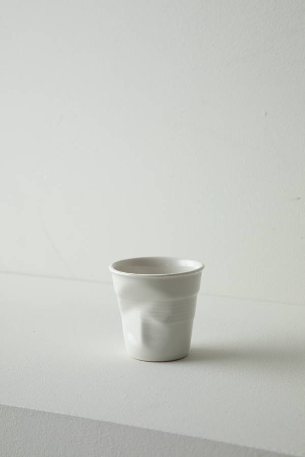
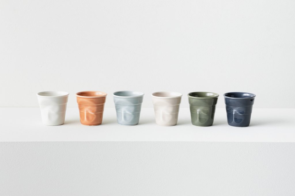
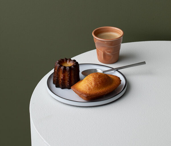
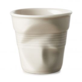
Colour is the main element of interior design, linking different objects. A cup placed on a pretty table against the backdrop of a beautifully coloured wall. Elements talk to one another and create a room’s harmony. Rethinking the range of colour for the Froissé cups was an honour for Ressource, as well as a lovely challenge and a vote of confidence.
Is this a first time for you in the world of ceramics? What did you learn from it?
Yes, it’s a first and we’re very happy to share this experience with Revol!
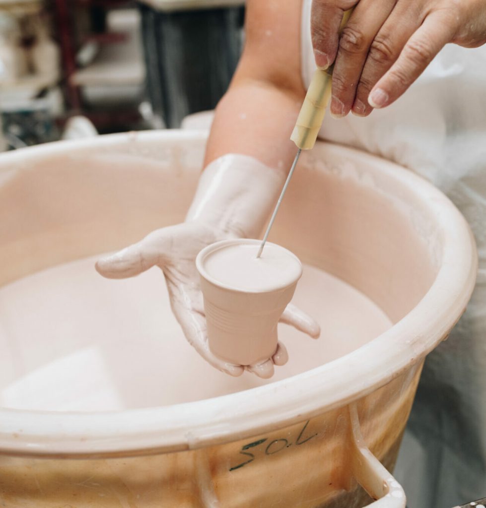
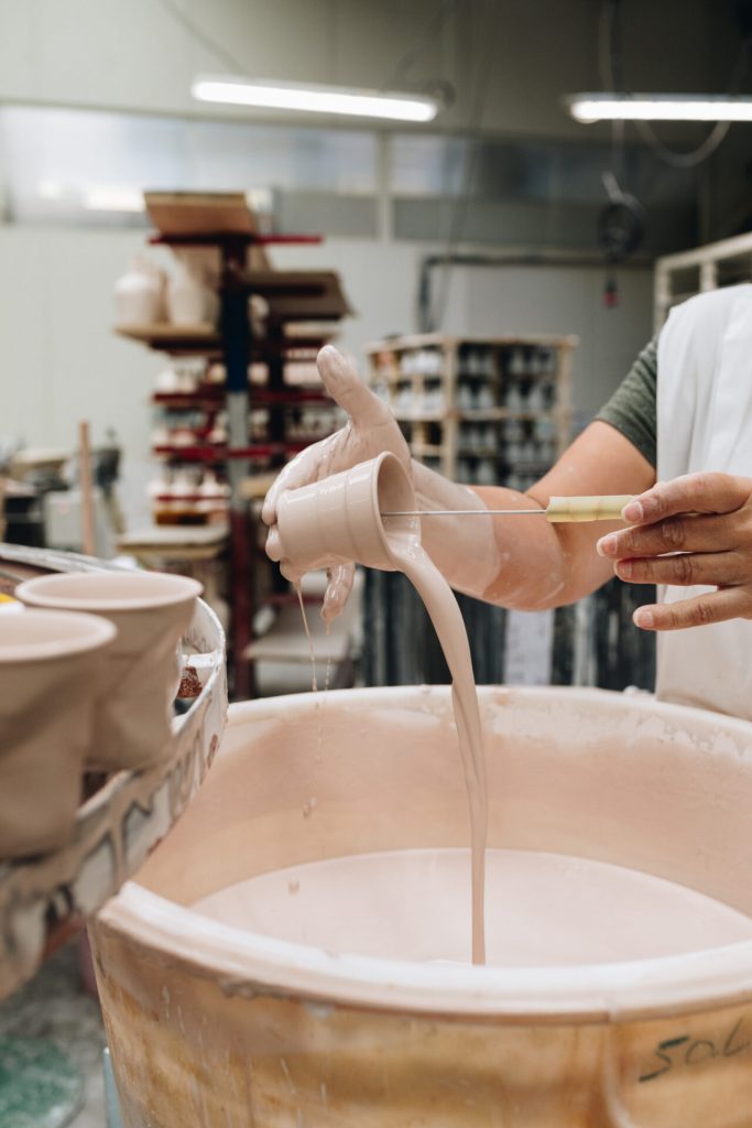
With Pauline, we visited Revol’s production workshops and were impressed by the presence of the women and men who work with their hands in the earth. Revol’s skills are unique and marvellous. It’s incredible to have maintained and developed all this through the years. We also transmit our skills down the generations. So we appreciate all the more the beauty and the rarity of this wonderful firm.
Ceramics are are a fascinating material. The product of natural ingredients and processes – earth, pigments, water, fire – they allow for so many possibilities, so much creativity.
We were also very concerned by the idea of serial production. How beautiful it was to see all these pieces waiting to dry, to be enamelled, to be stored in the workshops. What presence!
What do you think of the Froissé cup? Did its shape influence your colour choices?
Froissé is an impressive, uniquely shaped cup. The imprint of a hand makes it a living, sculptural object. Making colour work on an object with strong, complex reliefs was part of the process from the very start. We had to find colours that work with the shape in order to bring it out. So I created a palette echoing the simplicity and purity of nature.
What was the creative process with the Revol teams?
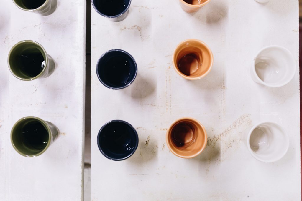
Everything really started the first day of working at Revol, where we were immersed in its universe, its workshops and its teams. I’d brought a selection of colours I’d worked on ahead of time that allowed us to get to know each other through talking about colour.
Then I carried mixing colours in order to offer three alternatives, from which the final palette was chosen. These six colours then went to the colourists in Revol’s lab to be formulated perfectly. Their expertise created very good results. It was marvellous to see the colours take shape on the cups. Two colours needed a little more research and we had to go back and forth to get the subtlety we wanted.
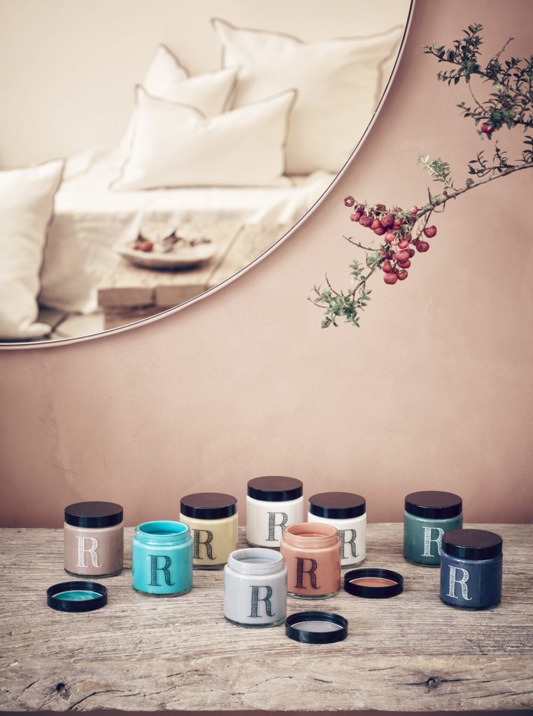
Can you describe this range of colours?
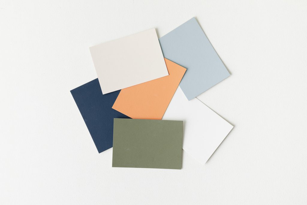
The range is made up of six colours created exclusively for Revol, conceived of as a walk through the natural surrounding of the South of France, where the senses are awakened by the smell of plants, the heat, the desire to touch the rocks, to contemplate the landscape and to breathe in fully to truly savour the air. The colours are inspired by raw, wild, simple nature with its array of materials: water, sky, earth, plants, rocks…
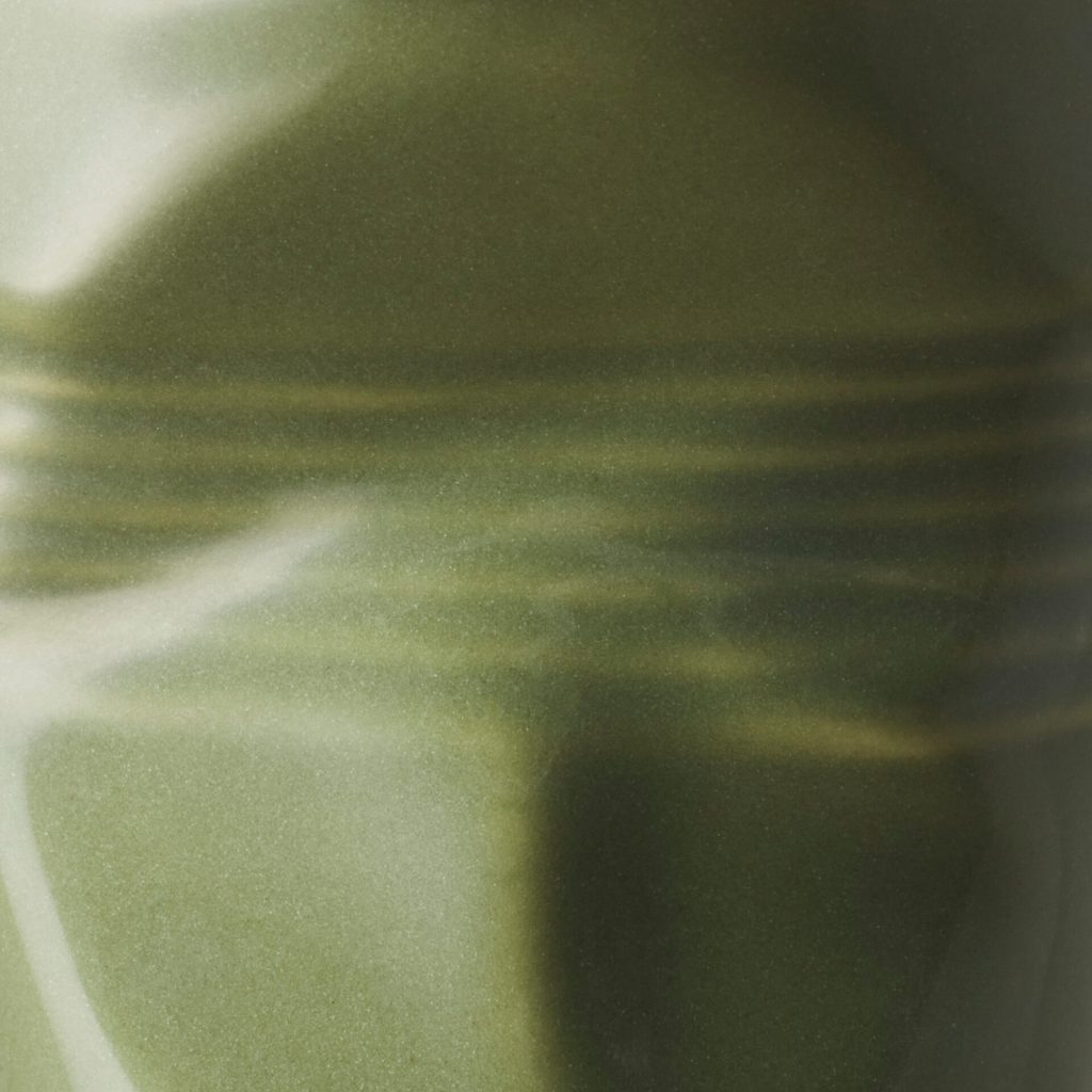
Created as semi-tones, these colours have the intangible mystery that comes from oscillating between two shades. Rich, varied, subtle and nuanced, they interact with light. Shadows play in the folds and hollows, creating nuances and reliefs of colour.
GREEN GARRIGUE:
A khaki with a hint of bronze – quite strong without being too dark. A compelling colour, rooted in the nature of the South of France where plants are bathed in sunshine and exposed to the wind, releasing their scent when they come into contact with stone. A hint of magenta softens it, and the sun shows through in its yellow tinge. It’s strong colour conveying
nature with all its aromatics, with its herbs to leave out to dry – a sophisticated, chic colour for strong decor.
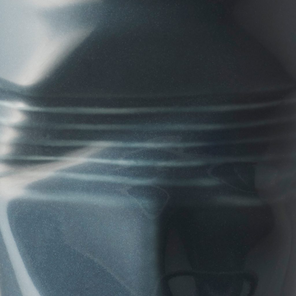
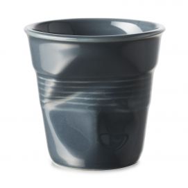
GRAPHITE:
A very dark grey bordering on black. A hint of magenta lights its up and enlivens it – this is what stops it being black. It’s a colour that makes you want to touch it to understand it and experience it more fully. Neither grey, nor black, nor blue, it is the very essence of a dark colour that one can’t classify. It simply exists. It’s a colour reminiscent of intensely matte raw volcanic rocks forged by fire, and of slate. It’s a characterful, bold colour; a neutral colour for low-key urban decor and celebrations.
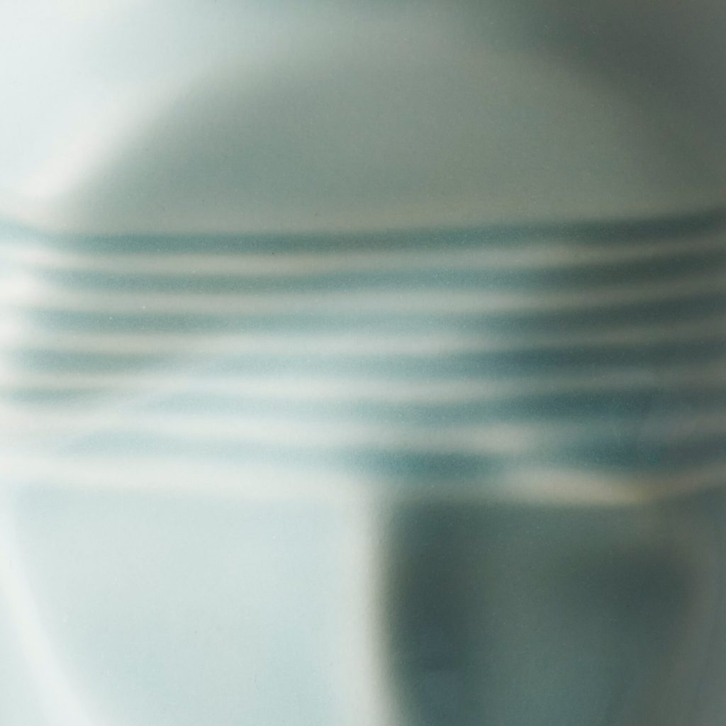
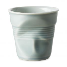
MISTRAL BLUE:
A blue enamoured of green, slightly toned down to create a gentle, precious colour. A hint of yellow gives it luminosity. It’s inspired by the blue skies of Provence, where the clouds have been swept away by the mistral and made way for a pure, intense expanse of blue. A velvety, pleasing colour. An accessible colour suited to luminous, gentle, contemporary decor.
GREY PEBBLE:
A light, neutral, warm beige enlivened by pink, yellow and brown for an icing-sugar hue. This colour puts one in mind of the the pebbles of the Rhône Valley but also of walking barefoot on the beach. Mineral, it is easily tamed. It’s a colour both classic and contemporary for low-key, discreetly elegant decor.
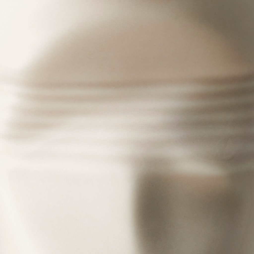
SHELL WHITE :
A subtle, nuanced white with a very subtle hint of yellow and brown to bring it a touch of warmth. This off-white is dear to Ressource, who believe that a well-chosen white is the keystone to successful decor. It goes well with the other colours because it has a small concentration of pigments that link it naturally to the rest of the range. It’s inspired by the small snail shells of Provence, the shells on Mediterranean beaches and delicate eggshells. It’s light as a breath. Neutral and low-key, its elegance makes it at home anywhere and in all types of interior.
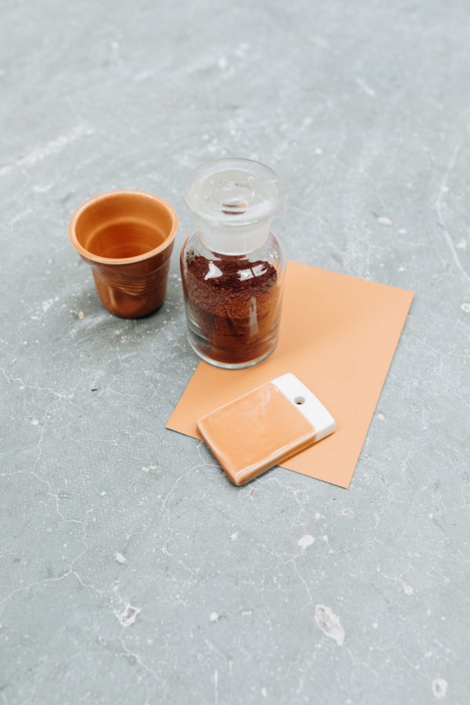
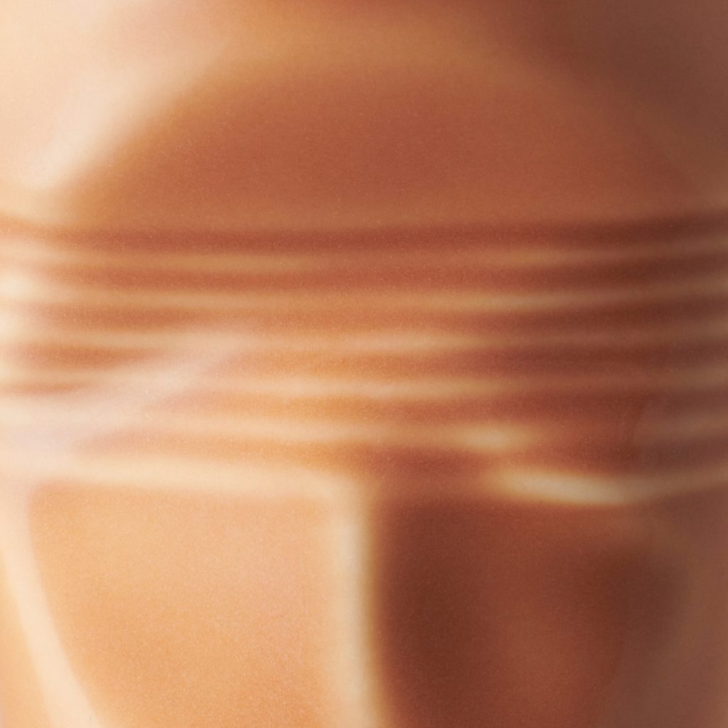
SIENNA EARTH :
A warm colour inspired by the ochres of Provence, this soft, slightly earthy orange reminds us of Provençal culture with its Italian inspiration. Fired earth, potteries and craftsmanship have inspired this well-rounded, sunny colour. It’s a bright but delicate hue that can both make itself known and blend in, ideal for interiors filled with crafts and natural materials.
How is it a collection?
We want these new colours to form a harmonious range where each cup contributes to the spirit of the collection. So they were conceived to talk to one another and to have a common spirit. Each colour exists in relation to the others but also independently. You can make combinations of two, three, four, five or six. The effect is inherently tasteful because the colours work well both together and alone.
Where can you imagine this cup in the home and for what style of decor?
Everywhere, to be honest, as this range allows for lots of possibilities – that’s how it’s been conceived. On a kitchen counter, on the starched tablecloth of a restaurant, on a fireside coffee table, on the edge of an desk or on a shady outdoor table… In the homes of both the young and the not so young, as the design of this cup goes beyond age. The range was designed for many tastes and decorative styles. It’s a measured, balanced range with warm, cool, light, strong, sober and bright colours.
To conclude our fascinating conversation, Revol has announced the extension of this partnership with Ressource. Without giving too much away, can you tell us a bit more?
Indeed, the adventure with Revol has only just begun and we’re already working on new colours to deepen the range. But let’s wait for the colours to be mixed before we say any more!
We use cookies on our website to give you the most relevant experience by remembering your preferences and repeat visits. By clicking “Accept All”, you consent to the use of ALL the cookies. However, you may visit "Cookie Settings" to provide a controlled consent.
This website uses cookies to improve your experience while you navigate through the website. Out of these, the cookies that are categorized as necessary are stored on your browser as they are essential for the working of basic functionalities of the website. We also use third-party cookies that help us analyze and understand how you use this website. These cookies will be stored in your browser only with your consent. You also have the option to opt-out of these cookies. But opting out of some of these cookies may affect your browsing experience.